Major Performance Improvements for Large Workflows
We're excited to announce significant performance enhancements for large workflows in our latest update. Users working with extensive datasets or intricate workflow structures will notice a substantial boost in speed and responsiveness.
These improvements will be most noticeable for users who:
- Have workflows with 1,000+ actions or approaching this scale
- Utilize change reports for large workflows (these will load significantly faster)
- Handle complex branching logic or nested structures within workflows
- Work with high volumes of data inputs and outputs
Key improvements include:
- Faster Loading Times: Workflows with large action sets now load considerably faster, reducing wait times and allowing users to get started more quickly.
- Optimized Editing: Making changes to workflows, including adding, editing, or deleting actions, is now smoother, with minimal lag even in complex workflows. This includes opening actions into Edit mode and saving or discarding any changes.
- Improved Responsiveness: UI elements now respond more swiftly, especially when navigating through large workflows or when managing detailed change reports.
- Better Memory Management: We've made backend optimizations to reduce memory usage, improving overall performance during long sessions.
These enhancements are designed to support users managing increasingly complex workflows, ensuring a more efficient and seamless experience as your workflows scale. We look forward to seeing how this update empowers you to work faster and smarter!
Selecting actions

Hold Shift and Click on any action to select that action. Clicking anywhere without holding Shift will deselect the selected action. When an action is selected, an action bar will appear at the bottom of the page, with the available operations.
When an action is selected, press Ctrl and C to copy that action to the clipboard. Press Ctrl, Alt and C to copy the action and its action path. You can now Paste the action(s) from the action menu (+). When the action menu is open, press Ctrl and V to quick paste the copied action(s). When an action is selected, press Del to delete the action. Press Del and Alt to delete the action and its path. All delete operations will prompt for confirmation before the operation is run.
Action output & output schema

The action port/output menu has been improved significantly. The menu now shows an Output schema (if such is available) that attempts to describe the shape of the output of a previous action. This menu also shows the latest output value that has passed through that action.

The action path lines now indicate which actions transmit output data (see the additional blue lines). The action port is colored different depending on if it sets a new output (blue circle) or if it just forwards an existing output (gray circle). An Arrow icon is displayed in the circle if a latest output value has been recorded.
Filter action improvements

The Filter action (Core) now allows for selecting between a number of different input types. The options are:
- Manual: Set a value manually using the provided input (Default).
- Custom function: Write a JavaScript function that returns the input value.
- Use previous action output: Use the previous action output provided to the Filter action.
- Use another field as input: Use the value of another field from the entity as the input.
Workflow builder performance improvements
The Workflow view has received a large performance boost. Each action is now rendered on-demand, meaning that only those actions that are visible on the screen are rendered. This should improve the performance of very large workflows (hundreds of actions) by a lot. This same technique is also used to improve the performance of the Data view.
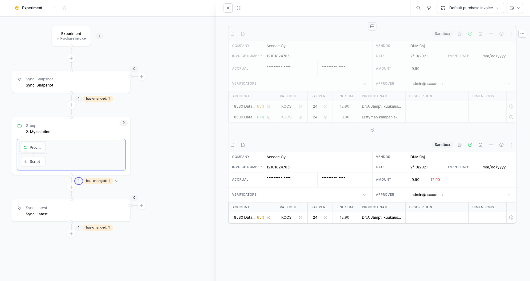
Improved snapshot picker
A more simple Snapshot picker is now available in the Data view. Opening the picker displays a table. The left-hand column indicates which action you used to open the view. The middle columns shows the available available snapshots (the actions in the current group as well as the Initial and Latest states). The right-hand side allows you to pick which snapshot you want to view.
The screenshot below has selected the snapshot after the “Automation” group action, which includes all the changes that the “Automation” group has given rise to. If the snapshot location is moved a single step upwards, it would show a snapshot just before the Automation group.

The right-hand column includes two lanes: the view lane (left) and the compare lane (right). Selecting snapshots from the compare lane allows for comparing two snapshots against each other.
In the screenshot below, we compare the snapshot before the “Automation” group and after the “Automation” group. We can see that the accountNumberAsInteger field has changed from a value of null to a value of 1001.

Improved comparison views
Each type of data view includes a companion comparison view: in this case we are looking at the JSON UI. You can toggle between a Merged view, which shows how the data changes between the start and the end point overlaid on top of each other in a single view. The Side-by-side view, in turn, shows the earlier snapshot on one side, and the later snapshot on the other side. The screenshot above shows an example of the Merged view, while the screenshot below shows a Side-by-side view of the same comparison.

Quick access to related data
Alongside Nested data, you can now access References and Queries from the Data menu for all data types. Most data usually references data that is not directly a part of the current data model, but that still may contain related information. References are direct links to data based on a particular field, and always return either a single data object or a null value. Queries are a more powerful alternative that allows for finding a particular set of data (one, many, or zero) based on a set of filter conditions.
In the screenshot below, the user can access referenced Company data, or query Invoice data. We can also access the Company via a query, if we are so inclined.
For everyday use, there is seldom a difference between accessing data via a Reference or a Query. The main differences are: 1) queries can return many data rows, while references always return (at most) a single data row, and 2) references are more quick by default.

Filter action can access References
Alongside Nested data and Queries, you can now also access References in the Filter action. References are discussed in more detail in the section “Quick access to related data”. Selecting a Reference or a Query gives access to fields from the referenced data model.
For example, if we select the Company reference from the Ledger receipt, we can now create a filter condition based on a field in the Company model, such as the businessId.

Improved Add Action Menu
The Add Action menu has been updated for improved usability. It now features a collapsible design, allowing less relevant packages to be collapsed by default to declutter the menu. You can easily open or collapse any section, and your choices will be remembered for your next visit. Additionally, to help new users, nested actions within each package are now clearly displayed, providing guidance on accessing more complex data and actions.

New Import Actions Features
The Import actions feature that was introduced in an earlier update has been improved. Importing a group of actions will automatically also importing the filters from the target workflow config. This will generate a new Filter action the top of the imported group that contains these filter conditions. This is meant to streamline importing solutions from a sandbox into a production workflow, without having to manually recreate the filters for each group separately. If no filters are imported, or if this feature is toggled off, no Filter action will be generated.
Note that the workflow filters are not always fully exhaustive, meaning that you may want to modify them before completing the import wizard.

New default method for accessing data in a workflow

We are improving the user experience in building workflows by enabling users to see and access more information without leaving the workflow. The revised metrics menu, located at the bottom-left of the screenshot, now includes the following buttons for a quick-access data slide-over:
- The 'View' button displays a snapshot of the data at that specific action and metric.
- The 'Compare' button provides a comparison view for the data for that specific action, highlighting changes to the data from when it entered the action to when it exited.
The previous default full-page data view can still be accessed through the 'Expanding Arrows' icon, located to the right of the 'X' icon (at the top-center of the screenshot).
Compare view alternative
Along with the current merged comparison view, which overlays changes from data points A and B, we're introducing a new side-by-side mode for comparing changes. This view is more suitable for comparing data with numerous changes and has the advantage of being interactive, unlike the merged view. The side-by-side view can be activated from the Comparison view menu located at the top of each data entity when in compare mode.
The default compare mode is still the merged mode.
New workflow navigation

We have streamlined the workflow navigation bar (which indicates your location within a workflow) and relocated it to the main navigation bar to conserve screen space in the workflow view.
In addition, each ‘/’ icon in the navigation bar is a drop-down menu that allows you to quickly jump to different parts of the workflow at that level. This feature is intended to make navigation within complex workflows easier and more efficient.
A new take on the data level visualization

The highlighted section replaces the former data level icon (previously at the bottom right), indicating the data level of the current workflow group. This view can be minimized by hovering over the icon and clicking the '-' icon.
Improved data navigation and sidebar

A new Data option has been added to the left sidebar. Clicking on this option will navigate the user to the Data page, which now includes a new Data sidebar. The Data sidebar provides a convenient way to view all data models, organized by component package. By default, the sidebar is hidden when accessing the Data view from a metric. However, you can toggle the visibility of the sidebar by clicking on the icon located to the right of the sidebar.
Advanced entity options

Along with small tweaks to the appearance of the Entity options menu, a new Advanced section has been added. The Advanced section provides the following capabilities:
- Rerunning the entity in the current action:
- For workflows that reset entity state (e.g. sandboxes, cron), the entity state and logs will be reset, and the entity will be run from the beginning of the workflow.
- For workflows that do not reset entity state (e.g. on-change, live), the entity will retry its current action and may proceed further in the workflow if it passes that action.
- If the entity is blocked by an action (e.g. delayed, in a task, or encountered an error), the user can also choose to:
- Retry the current action.
- Skip the action and route the entity along the true path (downward).
- Skip the action and route the entity along the false path (to the right).
Displaying metric names in the workflow

Toggle the Also show metric name checkbox in the Update metric menu to display the metric name in the workflow.
Change operations performance improvements
We’ve been hard at work improving the performance of both reading and generating change operations. This is more of a behind-the-scenes update, but it should drastically improve generating change operations and paves the way for even more improvements in the future, including a periodically scheduled workflow for generating change operations.
Action ports
Each action contains a set of ports that allow entities to enter and exit the action. Actions always have a single entry port and one or two exit ports. This update adds an Action Port Menu that displays information about the particular port, displays the latest action output that the action has generated, and allows for quick access to the action logs that have have been updated by that port. The port icon on the action is highlighted if the action has generated an output (See the blue port icons in the screenshot).

Tutorial component package
We have added a new Tutorial package (@accode/tutorial) that contains a Tutorial action that allows for creating a tutorial directly inside of a workflow. The action can be configured to contain many distinct steps and various completion conditions. The Tutorial action works with any type of workflow.
We will work to add example tutorials (workflows, dashboards and data) to the Tutorial package for getting started with Accode, which can also be used as a starting point for creating your own tutorials.

Embed widget

A new widget - Embed - is added to the default widgets package. This widget allows for embedding content from other websites, such as presentations from Google Slides or spreadsheets from Google Sheets.
Improved search

Press Ctrl + K to access the improved search/command pallette.
This modal allows you to navigate through workflows, dashboards, data and components, and allows you to perform a number of actions directly, such as creating a new workflow.
Sidebar improvements

We have moved the Search (see above), Notifications and Add components navigation links to the top-left of the Sidebar. Our intention is to highlight these more, as our users felt that these options should be more prominently displayed in the user interface.
Revamped create component modal
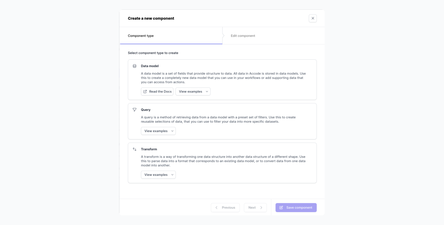
The various component editing views have been merged into a single modal/wizard, which includes a more detailed explanation and documentation for the various components and what they can be used for. This modal is accessible by opening the top-left Create menu, and selecting the Create a new component option.
Import actions from other workflows

Actions can now be imported from other workflows (or from another place in the same workflow). This menu can be accessed from the Paste action(s)... option in the Action Quickselect menu.
This is a maintenance release that adds a few convenience updates and bug fixes .
Ready to get started?
Learn more about building workflows or create an account and start building your own. You can also contact us to configure a custom package for your business.